I would like to share a step by step tutorial to build an amazing slider from scratch, using the magic of SVG clip-path feature and animations through the excellent Snap.svg library. If you are very curious to see the final result, it will be something like this (low quality for the sake of the gif format):
You can check the DEMO. There you can find some basic instructions for usage and link to github repository, where you will find a more comprehensive documentation, with options to customize the slider as you wish.
I want this tutorial to be useful as basic guide in case you want to create your own slider, so we’ll start creating a generic structure, which can be used as a base for almost any slider. Then we will incorporate the code to dynamically create all the elements that our slider needs, as well as the corresponding animations.
Our slider is inspired heavily in this interesting screen transition by Vaclav Krejci:
We will use this animated gif as a base and guide to create our animations. We will also use the concept of drag and drop to move the slides forward or backward.
Goals
Before starting our development, we will define the goals we want to achieve with it to meet our expectations. It is important to set realistic and clear goals, but at the same time push you to strive and improve yourself professionally. In this case, our main goals are as follows:
- Create a generic structure in JavaScript, which allows it to be used as a base for developing a custom slider.
- Create a slider that responds to drag and drop mouse events, running animations based closely on the gif selected as inspiration.
- The slider should be offered as a library, which does not require the end users dirtying the HTML, CSS or JavaScript with a lot of extra code.
We already have defined our goals, so we can begin to develop our slider.
Creating the basic functionality
We start by creating a simple function that represents a class, and that allows us to create instances of our slider. This function will receive as parameters an HTML Element and an object with optional configurations. Although we have not yet defined the options that will provide, it is good to have it in mind.
function ElasticSlider(el, options){
    this.el = typeof el === 'string' ? document.querySelector(el) : el;
}
Note that parameter el can be a DOM Element, or a string to select a DOM Element. Pretty simple so far, but we can now create instances of our slider in the way:
var slider = new ElasticSlider('.my-elastic-slider');
Right now our slider does almost nothing, let’s add some basic functionality, extending our function through the prototype. First, we will create a function to get slider elements and initialize the indexes for the current, previous and next items. In addition, we will create a function to update the order of the elements using the new indexes. This will allow us to know and update the order of items without having to interact with the DOM.
ElasticSlider.prototype = {
    // ...

    initOrder: function () {
        this.currentIndex = 0;
        this.prevIndex = this.len - 1;
        this.nextIndex = 1;
        this.updateElements();
    },

    updateElements: function () {
        this.currentItem = this.items[this.currentIndex];
        this.prevItem = this.items[this.prevIndex];
        this.nextItem = this.items[this.nextIndex];
    }
};
Now let’s create the functions that we will use to update the indexes. If we move to a previous item, we must try to subtract 1 from all indexes, and in case we want to move to the next item in the slider, we must try to add 1. In performing these operations, we have to consider that the indexes are not out of range. So, the first thing we can think may be something like this.
ElasticSlider.prototype = {
    // ...

    prev: function () {
        this.currentIndex = this.currentIndex > 0 ? this.currentIndex - 1 : this.len - 1;
        this.prevIndex = this.prevIndex > 0 ? this.prevIndex - 1 : this.len - 1;
        this.nextIndex = this.nextIndex > 0 ? this.nextIndex - 1 : this.len - 1;
    },

    next: function () {
        this.currentIndex = this.currentIndex + 1 < this.len ? this.currentIndex + 1 : 0;
        this.prevIndex = this.prevIndex + 1 < this.len ? this.prevIndex + 1 : 0;
        this.nextIndex = this.nextIndex + 1 < this.len ? this.nextIndex + 1 : 0;
    }
};
Not bad, but obviously there is a lot of code that repeats itself, that’s a sign that maybe we should refactor to reuse it. Let’s see how we have simplified the code after a necessary refactor.
ElasticSlider.prototype = {
    // ...

    initOrder: function () {
        this.currentIndex = 0;
        this.updateElements();
    },

    updateElements: function () {
        this.currentItem = this.items[this.currentIndex];
        this.prevItem = this.items[this.getPrevIndex()];
        this.nextItem = this.items[this.getNextIndex()];
    },

    prev: function () {
        this.currentIndex = this.getPrevIndex();
    },

    next: function () {
        this.currentIndex = this.getNextIndex();
    },

    getPrevIndex: function () {
        return this.currentIndex > 0 ? this.currentIndex - 1 : this.len - 1;
    },

    getNextIndex: function () {
        return this.currentIndex + 1 < this.len ? this.currentIndex + 1 : 0;
    }
};
Note how we have simplified our code by eliminating prevIndex and nextIndex, because we really do not need them, and re-calculating indexes through getPrevIndex and getNextIndex functions, always based on the current index.
Thus, we have developed a simple base that can be used to develop a custom slider. Consequently we have accomplished our first goal and we can move forward.
Adding SVG stuff
To achieve the desired effect, we will be using the clip path feature included in CSS and SVG. If you need some information, you can check this excellent article, where Sara Soueidan explains in detail the clipping techniques in both CSS and SVG, covering everything you need to know to get started. For all work related with SVG, we will be using the Snap.svg library, which will allow us to create and traverse the SVG tree, perform animations, etc.
As we want to keep all the work related with SVG transparent to end users, we need to generate SVG elements dynamically. Let’s see how to create a root svg element and two clipPath elements, one of them to run the “prev animation” and another for the “next animation”. We want to create a structure like this, but dynamically:
<svg>
    <defs>
        <clipPath id="clipped-left">
            <path d="..."></path>
        </clipPath>
        <clipPath id="clipped-right">
            <path d="..."></path>
        </clipPath>
    </defs>
</svg>
Fortunately, we have Snap.svg for traversing the SVG tree, and some basic JavaScript is enough to create the elements:
ElasticSlider.prototype = {
    // ...

    initSVG: function () {
        this._svgNS = 'http://www.w3.org/2000/svg';
        this.clippedLeft = document.createElementNS(this._svgNS, 'clipPath');
        this.clippedRight = document.createElementNS(this._svgNS, 'clipPath');
        this.clippedLeft.id = 'clipped-left';
        this.clippedRight.id = 'clipped-right';
        this.s = new Snap(this.sliderWidth, this.sliderHeight);
        this.s.select('defs').node.appendChild(this.clippedLeft);
        this.s.select('defs').node.appendChild(this.clippedRight);
        this.el.appendChild(this.s.node);
    }
};
The portions of the element that are shown or hidden are determined by a clipping path. So we need to create a path for each clipPath element. In my opinion, this is the most difficult part of the process, because it can be a bit tedious build paths “by hand”, that is, without using any vector editor. But for our slider (and for this kind of interactions in general), this process is essential not only to build the paths by hand, but to dynamically build them according to our needs.
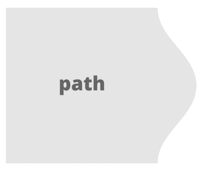
Visually, we want to get something like this.
Basically it is a path formed by three straight lines and a curve, but we must be able to dynamically update the path to achieve the desired animations. After several manual tests, we have created the following function, which receives several options in object format, and returns the path built in string format.
ElasticSlider.prototype = {
    // ...

    createPath: function (o) {
        var x1 = o.x1, y1 = o.y1, x2 = x1, y2 = o.y2, x3 = (x1 + o.width), y3 = (y2 - y1) / 2, len = o.bezierLen, offset = o.offset;
        var out = ["M", x1 + offset, y1, "C", x1 + offset, (y1 + len), x3 + offset, (y3 - len), x3 + offset, y3, "S", x2 + offset, (y2 - len), x2 + offset, y2, "L"];
        o.leftSide ? out.push(x1, y2, "L", x1, y1) : out.push(x1 + offset*2, y2, "L", x1 + offset*2, y1);
        return out.join(" ");
    }
};
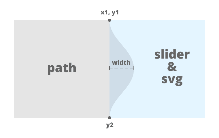
To understand a little better how the above function works, let’s look at the following image, and review the options it receives as a parameter (as properties of o object), along with a brief description:
<strong>x1</strong>: X coordinate of the top point of the curve.<strong>y1</strong>: Y coordinate of the top point of the curve.<strong>y2</strong>: Y coordinate of the bottom point of the curve.<strong>width</strong>: Total length of the curve, measured on the X axis.<strong>bezierLen</strong>: Length of the control points of the curve. Longer lengths produces pronounced curves and lengths close to zero produces more sharp curves.<strong>offset</strong>: Path offset on the X axis. Typically the width of the slider.<strong>leftSide</strong>: Boolean to define whether you are drawing the left path or the right.
Using this function, we can create paths that define the clipped area, and insert them into each clipPath element as needed. This function will help us to get the paths that we will use in the animations too, so it is an essential piece in our slider. For example, to build the initial path for the “prev animation”, it would be something like this:
// ...
this.optionsLeft = {
    x1: 0,
    y1: 0,
    y2: this.sliderHeight,
    width: 0,
    bezierLen: this.bezierLen,
    offset: this.sliderWidth,
    leftSide: true
};
this.curveLeft = this.createPath(this.optionsLeft);
To achieve the basic animations, simply change the width option with the proper value, and we will get a new path without too much effort.
Responding to mouse events
Let’s see now how to handle the click events to animate the paths as needed. To simulate a drag and drop interaction in our animation, we must handle the following events: mousedown, mousemove and mouseup. It is not so difficult, let’s see how.
When the mousedown event is triggered, and whenever there is no animation in progress, we need to define a variable to indicate that the click is pressed and held. We also need the initial X position of the cursor, to animate the paths as the cursor moves. Something like this:
ElasticSlider.prototype = {
    // ...

    initDown: function () {
        var self = this;
        self.el.onmousedown = function(e){
            if(!self.animating) {
                self.mouseDown = true;
                self.initialX = e.pageX;
            }
        };
    }
};
In the mousemove event, the first thing to do is to check that the click is held and that there are no animation running. If these conditions are met, then we calculate how far the cursor has moved from its initial X position. Then, depending on whether the cursor has moved to the left or to the right, we must run the next and previous animations correspondingly.
ElasticSlider.prototype = {
    // ...

    initMove: function () {
        var self = this;
        self.el.onmousemove = function(e){
            if(self.mouseDown && !self.animating){
                self.width = e.pageX - self.initialX;
                if(e.pageX > self.initialX){
                    self.prevAnimation();
                }else{
                    self.nextAnimation();
                }
            }
        };
    }
};
When the mouseup event is triggered, we still need to check that the click is held and that there is no animation running. As long as these conditions are met, what we do is update the held click indicator, because that it is no longer pressed. In addition, we must transform the paths to their original states with a simple animation powered by Snap.svg. Something like this:
ElasticSlider.prototype = {
    // ...

    initUp: function () {
        var self = this;
        document.onmouseup = function(){
            if(self.mouseDown && !self.animating){
                self.mouseDown = false;
                self.pLeft.stop().animate({'path' : self.curveLeft}, 200, mina.easeout);
                self.pRight.stop().animate({'path' : self.curveRight}, 200, mina.easeout);
            }
        };
    }
};
Animation time
We should note that the animations we want to achieve will have three main parts. The first is when you click and drag, where the path should be animated in correspondence with the movement of the cursor. A second part will be triggered if the path is “stretched” to a certain limit, where will be animated to show the next or previous item in the slider with an elastic animation. A third possibility would be that the path does not reach the limit of “stretching” and the mouseup event is triggered, then the path should be animated to its original shape. We have covered this latest animation in the mouseup event handler, so we only have to worry about defining animations for the others scenarios.
Let’s see how looks like the function responsible for the animation to the previous slide. I have briefly commented the code for a better understanding.
ElasticSlider.prototype = {
    // ...

    prevAnimation: function () {
        var self = this;
        // Ensure the other path (right) is in its original position
        self.pRight.stop().attr({'path' : self.curveRight});
        if(self.width < self.maxStretch){
            // Animate the path as cursor moves
            self.optionsLeftAux.width = self.width;
            self.pLeft.stop().attr({ d: self.createPath(self.optionsLeftAux) });
        }else{
            // Path is "stretched" to the defined limit, so calc the curves (middleCurve, middleCurve2, totalCurve) for elastic animation
            self.mouseDown = false;
            self.animating = true;
            self.optionsLeft.x1 = self.maxStretch*2;
            self.optionsLeft.width = - self.maxStretch*3/4;
            var middleCurve = self.createPath(self.optionsLeft);
            self.optionsLeft.x1 = self.maxStretch*2;
            self.optionsLeft.width = self.maxStretch/4;
            var middleCurve2 = self.createPath(self.optionsLeft);
            self.optionsLeft.x1 = self.maxStretch*3;
            self.optionsLeft.width = 0;
            var totalCurve = self.createPath(self.optionsLeft);
            // Move the path to the right side, showing the previous slide
            self.pLeft.stop().animate({'transform' : 't-'+(self.maxStretch*3 - 50)+',0'}, 300, mina.easein, function(){
                self.pLeft.animate({'transform' : 't-'+(self.maxStretch*3)+',0'}, 200, mina.easein);
            });
            // Here is where elastic animation happens, using calculated curves
            self.pLeft.animate({'path' : middleCurve}, 200, mina.easein, function(){
                self.pLeft.animate({'path' : middleCurve2}, 100, mina.easein, function(){
                    self.pLeft.animate({'path' : totalCurve}, 200, mina.easein, function(){
                        self.prev();
                        self.updateStates();
                        self.pLeft.stop().attr({d: self.curveLeft, transform: 't-'+self.sliderWidth+', 0'});
                        self.animating = false;
                    });
                });
            });
        }
    }
};
Using the slider
Finally, our slider is ready to use! You only need a simple piece of code to get it working:
<div class="elastic-slider">
    <div id="image1"></div>
    <div id="image2"></div>
    <div id="image3"></div>
</div>

<script> new ElasticSlider('.elastic-slider'); </script>
Don’t forget to check the DEMO, and the full documentation on github.
Summing up
Throughout this tutorial we have seen how to develop a genuine elastic slider from scratch. We have fulfilled every one of our goals, creating a reusable generic base, smooth animations, and a usable slider without overloading the end user code.
Note that we have omitted the code of CSS styles, as well as other minor, to focus on the development of the slider. Anyway, you can get the full code on github.
Also note this is a highly experimental project.
Browser support is limited, but it should work well in latest versions of Chrome, Firefox and Opera. Internet Explorer and Edge are not supported at all, and Safari can run animations slowly sometimes.
I really hope you enjoyed this tutorial and find it inspiring and useful!
TABLE OF CONTENTS


