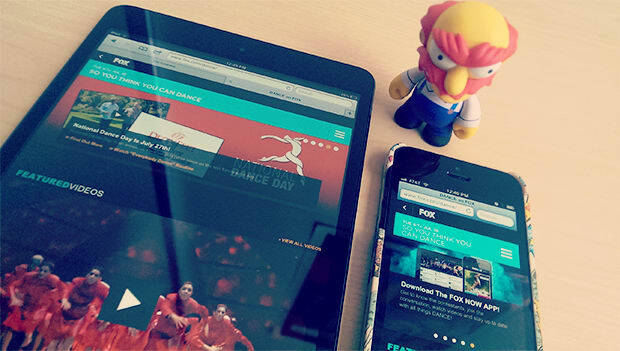
When FOX Broadcasting came to X-Team VIP earlier this year asking to “responsive-ize” the redesign for “So You Think You Can Dance” (in a mere two months no less), we knew it would be quite an adventure.
Almost six months later, an “adventure” now seems like an understatement.
In a very short time, we’ve completely redefined workflows for multiple teams, built responsive templates that have been used for multiple FOX shows (including the upcoming season of The X-Factor), and helped increase mobile traffic significantly (/five to the superheroes on the team for that win).
Here are a few takeaways (and trust me, there are many more beyond these).
Lessons learned
The new world: Designers are developers, and developers are designers
I think designers are both excited and freaked out now that you can’t get away with not understanding code and the need to not only better define functionality requirements, but be able to envision them.
I see the same feelings from developers, as well — the sudden need to better understand layouts, how to make a great UX, help inspire designers with things like never-before-seen responsive navigations.
The ‘great divide’ between design & dev is getting smaller every day, and it’s making for quite the adventure with new workflows.
*Suggestion: If you’re a dev, start subscribing to some design blogs (and vice versa). *
Tablet portrait should be magical

Whether it’s laziness or simply oversight, it’s incredibly tempting to only do simple layout downsizing when going from desktop to tablet, but honestly, tablet should offer a unique experience. I don’t think we really realized that until the iPad mini, and suddenly we could create more ‘magical’ experiences that make content really pop out and almost into your hands.
The tablet portrait design (see right) is a great example of how we broke to one column to put greater focus on the video player and key content.
Don’t rush responsive
As much as people would love to think that ‘responsive’ is magic fairy dust you just throw on at the end of a desktop build, we need to change that perception…quickly.
Set expectations clearly from the start that responsive = longer dev cycles. Although we built a massive responsive codebase that has been reused for many sites in a mere four weeks, next time we’ll do better at setting expectations.
Never settle for ‘I know media queries’
There’s no doubt that we wouldn’t have ever achieved what we did in four weeks (code-wise) without some of the best responsive experts in the world (from the X-Team community, of course) on the team.
A lot of devs today are putting ‘responsive design’ as a skill on their profiles, but 80% of the time that means they know media queries and how to type ‘width:100%’. Never settle, always enlist the best. Responsive is far too complex, ever-changing and in high-demand to ever consider settling.
You’re cooler than Bootstrap
Twitter Bootstrap (and the myriad of other responsive frameworks) are a great way to do rush jobs. They’re also a great way to learn the concepts of responsive design.
But they’re not something you should use as the base for a significant project. Become a media query superhero, and build your own framework. You’ll thank me later.
Responsive actually makes a difference in traffic
Last but not least, I was incredibly shocked (although not entirely) to discover that within a month, mobile traffic to FOX’s responsive-based show sites skyrocketed. That’s without any marketing regarding their mobile-friendliness.
Although it’s common sense — that people are more likely to use and continue to use a useable site on mobile — it’s both refreshing and surprising to see how quickly it can have an effect on traffic.
All the more reason to push your ‘powers that be’ to get in on it now.
TABLE OF CONTENTS


