
SVG has been gaining a deserved space in the stack technologies used by front-end developers. One of the most amazing things included in SVG are paths, which can be animated to achieve effects like today I will show you.
The idea that we will develop in this tutorial is basically a few loading buttons that will be able to give a feedback response, showing whether the button action succeeded or failed. To achieve the desired animations we will be using SVG and Segment mostly. Just to give you an idea of the kind of animations that we will be doing, take a look at the dribbble shot Circle Loading Animation by Warren Lebovics. But also we will be creating two more animations, inspired in loaders I have seen dispersed around. If you are very curious to see the result, look at the demo
Basic knowledge
Before starting the development of our fantastic loading buttons, we need to have some basic knowledge about the technologies that we will be using.
Maybe you know that SVG has included several basic geometric shapes such as circles, ellipses and rectangles. But unfortunately, only paths can be used for line animations. This causes everything that we will be drawing must be using paths, even if we want to achieve a circle, for example. So, you must know how to draw the SVG paths you want, just using lines, bezier curves and arcs. Mozilla Developer Network (MDN) offers one of the best tutorials you can follow to understand how to draw paths.
In addition, for line animations, we will be using Segment, a tiny library that will facilitate our work. If you do not already know it, I’m inviting you to play with its demo, and to review its documentation on github.
Of course, you must also have a basic knowledge of HTML, CSS and JavaScript, but you already know that, right?
Drawing, maybe the hard part
To make this kind of animations be as perfect as possible, the best thing we can do is to draw the paths “by hand”. Though this is a little difficult at first, it becomes very simple when you have a basic understanding. So, if you are ready, let’s draw our first loader!
<svg width="120px" height="120px">
    <path class="outer-path" stroke="#fff" d="M 60 60 m 0 -50 a 50 50 0 1 1 0 100 a 50 50 0 1 1 0 -100"></path>
    <path class="inner-path" stroke="rgba(255, 255, 255, 0.5)" d="M 60 60 m 0 -30 a 30 30 0 1 1 0 60 a 30 30 0 1 1 0 -60"></path>
    <path class="success-path" stroke="#fff" d="M 60 10 A 50 50 0 0 1 91 21 L 75 45 L 55 75 L 45 65"></path>
    <path class="error-path" stroke="#fff" d="M 60 10 A 50 50 0 0 1 95 25 L 45 75"></path>
    <path class="error-path2" stroke="#fff" d="M 60 30 A 30 30 0 0 1 81 81 L 45 45"></path>
</svg>
And let’s add some style:
body{
  background: #354458;
}

svg path{
  stroke-linecap: round;
  stroke-linejoin: round;
  stroke-width: 4;
  fill: none;
}
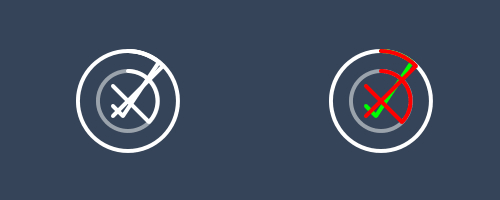
This SVG code has been created step by step, just using lines and arcs. And with a minimum of CSS, we can get the result we want (left image). The image on the right shows the error and success paths colored, for better understanding:
Animating with Segment
The animation is the most fun part, of course, but also one that requires patience, because achieving the perfect timing often it is not easy. Below I show you the necessary code to achieve this circular loading.
var outer = document.querySelector('.outer-path'),
    inner = document.querySelector('.inner-path'),
    outerSegment = new Segment(outer, 0, 0.1),
    innerSegment = new Segment(inner, 0, 0.1);

function outerAnimation(){
    outerSegment.draw('15%', '25%', 0.2, {callback: function(){
        outerSegment.draw('75%', '150%', 0.3, {circular:true, callback: function(){
            outerSegment.draw('70%', '75%', 0.3, {circular:true, callback: function(){
                outerSegment.draw('100%', '100% + 0.1', 0.4, {circular:true, callback: function(){
                    outerAnimation();
                    innerAnimation();
                }});
            }});
        }});
    }});
}

function innerAnimation(){
    innerSegment.draw('20%', '80%', 0.6, {callback: function(){
        innerSegment.draw('100%', '100% + 0.1', 0.6, {circular:true});
    }});
}

outerAnimation();
innerAnimation();
Creating a generic library
The code we’ve written works well so far for this example, although we still have not handled error and success responses. But what if we want to add new loaders? A possible answer to this issue is to build a generic library or plugin, to allow working with any loader we want to implement in the future. Let’s take a look at the code, it is briefly commented for better understanding:
function LoadingButton(el, options){
    this.el = el;
    this.options = options;
    this.init();
}

LoadingButton.prototype = {
    // Initialize everything
    init: function(){
        this.infinite = true;
        this.succeed = false;
        this.initDOM();
        this.initSegments();
        this.initEvents();
    },

    // Create an span element with inner text of the button and insert the corresponding SVG beside it
    initDOM: function(){
        this.el.innerHTML = '<span>' + this.el.innerHTML + '</span>';
        this.span = this.el.querySelector('span');
        var div = document.createElement('div');
        div.innerHTML = document.querySelector(this.options.svg).innerHTML;
        this.svg = div.querySelector('svg');
        this.el.appendChild(this.svg);
    },

    // Initialize the segments for all the paths of the loader itself, and for the success and error animations
    initSegments: function(){
        for(var i = 0, paths = this.options.paths, len = paths.length; i < len; i++){
            paths[i].el = this.svg.querySelector(paths[i].selector);
            paths[i].begin = paths[i].begin ? paths[i].begin : 0;
            paths[i].end = paths[i].end ? paths[i].end : 0.1;
            paths[i].segment = new Segment(paths[i].el, paths[i].begin, paths[i].end);
        }
        this.success = this.el.querySelector('.success-path');
        this.error = this.el.querySelector('.error-path');
        this.error2 = this.el.querySelector('.error-path2');
        this.successSegment = new Segment(this.success, 0, 0.1);
        this.errorSegment = new Segment(this.error, 0, 0.1);
        this.errorSegment2 = new Segment(this.error2, 0, 0.1);
    },

    // Initialize the click event in loading buttons, that trigger the animation
    initEvents: function(){
        var self = this;
        self.el.addEventListener('click', function(){
            self.el.disabled = 'disabled';
            classie.add(self.el, 'open-loading');
            self.span.innerHTML = 'Sending';
            for(var i = 0, paths = self.options.paths, len = paths.length; i < len; i++){
                paths[i].animation.call(self, paths[i].segment);
            }
        }, false);
    },

    // Make it fail
    triggerFail: function(){
        this.infinite = false;
        this.succeed = false;
    },

    // Make it succeed
    triggerSuccess: function(){
        this.infinite = false;
        this.succeed = true;
    },

    // When each animation cycle is completed, check whether any feedback has triggered and call the feedback
    // handler, otherwise it restarts again
    completed: function(reset){
        if(this.infinite){
            for(var i = 0, paths = this.options.paths, len = paths.length; i < len; i++){
                if(reset){
                    paths[i].segment.draw(0, 0.1);
                }
                paths[i].animation.call(this, paths[i].segment);
            }
        }else{
            this.handleResponse();
        }
    },

    // Handle the feedback request, and perform the success or error animation
    handleResponse: function(){
        for(var i = 0, paths = this.options.paths, len = paths.length; i < len; i++){
            paths[i].el.style.visibility = 'hidden';
        }
        if(this.succeed){
            this.success.style.visibility = 'visible';
            this.successAnimation();
        }else{
            this.error.style.visibility = 'visible';
            this.error2.style.visibility = 'visible';
            this.errorAnimation();
        }
    },

    // Success animation
    successAnimation: function(){
        var self = this;
        self.successSegment.draw('100% - 50', '100%', 0.4, {callback: function(){
            self.span.innerHTML = 'Succeed';
            classie.add(self.el, 'succeed');
            setTimeout(function(){ self.reset(); }, 2000);
        }});
    },

    // Error animation
    errorAnimation: function(){
        var self = this;
        self.errorSegment.draw('100% - 42.5', '100%', 0.4);
        self.errorSegment2.draw('100% - 42.5', '100%', 0.4, {callback: function(){
            self.span.innerHTML = 'Failed';
            classie.add(self.el, 'failed');
            setTimeout(function(){ self.reset(); }, 2000);
        }});
    },

    // Reset the entire loading button to the initial state
    reset: function(){
        this.el.removeAttribute('disabled');
        classie.remove(this.el, 'open-loading');
        this.span.innerHTML = 'Send';
        classie.remove(this.el, 'succeed');
        classie.remove(this.el, 'failed');
        this.resetSegments();
        this.infinite = true;
        for(var i = 0, paths = this.options.paths, len = paths.length; i < len; i++){
            paths[i].el.style.visibility = 'visible';
        }
        this.success.style.visibility = 'hidden';
        this.error.style.visibility = 'hidden';
        this.error2.style.visibility = 'hidden';
    },

    // Reset the segments to the initial state
    resetSegments: function(){
        for(var i = 0, paths = this.options.paths, len = paths.length; i < len; i++){
            paths[i].segment.draw(paths[i].begin, paths[i].end);
        }
        this.successSegment.draw(0, 0.1);
        this.errorSegment.draw(0, 0.1);
        this.errorSegment2.draw(0, 0.1);
    }
};
And of course, some necessary styles to complete the animation process. Note that I’m using SCSS (not just CSS) and I have already included styles for the others loaders:
// Loading button
.loading-button{
  // When loading button is open
  &.open-loading{
    color: rgba(255, 255, 255, 0.8);
    &.infinity{
      padding-top: 80px;
    }
    svg{
      display: inline-block;
      visibility: visible;
      opacity: 1;
      transition: 1s opacity;
      transform: translateX(-50%);
    }
  }
  // Loading failed
  &.failed{
    background-color: #EB7260;
  }
  // Loading succeed
  &.succeed{
    background-color: #29ABA4;
  }
  // Remove transition when changing demo position
  &.no-transition{
    transition: 0s;
    *{
      transition: 0s;
    }
  }
  // SVG element, centered and hidden initially
  svg{
    visibility: hidden;
    position: absolute;
    left: 50%;
    transform: translateX(-50%);
    opacity: 0;
    transition: 0s;
    path{
      stroke-linecap: round;
      stroke-linejoin: round;
      stroke-width: 4;
      fill: none;
      // To hide success and error paths
      &.success-path, &.error-path, &.error-path2{
        visibility: hidden;
      }
    }
  }
}

// Handle positions
.loading-button {
  &.top {
    svg{
      top: 10px;
    }
  }
  &.bottom {
    svg{
      bottom: 10px;
    }
  }
  &.left {
    svg {
      top: 50%;
      transform: scale(0.25) translateY(-50%);
      transform-origin: 0 0 0;
      left: 20px;
    }
  }
  &.right {
    svg {
      top: 50%;
      transform: scale(0.25) translateY(-50%);
      transform-origin: 100% 0 0;
      left: auto;
      right: 20px;
    }
  }
  &.open-loading {
    &.left {
      padding-left: 60px;
    }
    &.right {
      padding-right: 60px;
    }
    &.top, &.bottom {
      svg{
        transition-delay: 0.2s;
      }
    }
    &.circular-loading, &.circle-loading {
      &.top {
        padding-top: 140px;
      }
      &.bottom {
        padding-bottom: 140px;
      }
    }
    &.infinity-loading {
      &.top {
        padding-top: 80px;
      }
      &.bottom {
        padding-bottom: 80px;
      }
    }
  }
}
Using the new generic library
With the new library we have implemented, the SVG code can be put in a template, like:
<script type="text/template" id="circular-loading"> <svg width="120px" height="120px"> <path class="outer-path" stroke="#fff" d="M 60 60 m 0 -50 a 50 50 0 1 1 0 100 a 50 50 0 1 1 0 -100"></path> <path class="inner-path" stroke="rgba(255, 255, 255, 0.5)" d="M 60 60 m 0 -30 a 30 30 0 1 1 0 60 a 30 30 0 1 1 0 -60"></path> <path class="success-path" stroke="#fff" d="M 60 10 A 50 50 0 0 1 91 21 L 75 45 L 55 75 L 45 65"></path> <path class="error-path" stroke="#fff" d="M 60 10 A 50 50 0 0 1 95 25 L 45 75"></path> <path class="error-path2" stroke="#fff" d="M 60 30 A 30 30 0 0 1 81 81 L 45 45"></path> </svg> </script>
The refactored animation code to work with the new library, would be as follows:
function circularLoading(){
    var button = document.querySelector('.loading-button'),
        options = {
            svg: '#circular-loading',
            paths: [
                {selector: '.outer-path', animation: outerAnimation},
                {selector: '.inner-path', animation: innerAnimation}
            ]
        },
        loading = new LoadingButton(button, options);

    function outerAnimation(segment){
        var self = this;
        segment.draw('15%', '25%', 0.2, {callback: function(){
            segment.draw('75%', '150%', 0.3, {circular:true, callback: function(){
                segment.draw('70%', '75%', 0.3, {circular:true, callback: function(){
                    segment.draw('100%', '100% + 0.1', 0.4, {circular:true, callback: function(){
                        self.completed(true);
                    }});
                }});
            }});
        }});
    }

    function innerAnimation(segment){
        segment.draw('20%', '80%', 0.6, {callback: function(){
            segment.draw('100%', '100% + 0.1', 0.6, {circular:true});
        }});
    }

    return loading;
}
In the same way, to add a new loader, just we have to create a template for it and define the animation function associated with each path. Then we just need to call the LoadingButton function with the button you want and the options (template selector and a list of paths with associated animation functions).
Summing up
It remains for me to invite you to see the demo, where you can play with all possible options. You can also check the full code on github.
As you have noticed, the possibilities of line animations with Segment are very large. Here we have created loading buttons, but you can create the animation you want with a little effort. I hope this tutorial has been helpful and inspiring to you, hope to see your own cool animations soon!
SHARE:


