
Android as an operating system has undergone many visual overhauls over the years, and the current incarnation of those is Material Design. The comprehensive guide from Google thoroughly explains its concepts, but probably concerns designers and UI experts the most. From a programmers perspective though, some of the effects were difficult to achieve and were inconsistent across applications because of using custom solutions or third-party libraries. Thankfully, Google created the Design Support Library that now contains all commonly used visual components for us to use. No more custom code needed.
The following tutorial contains an overview of the Material Design UI components with example code for including and customising them in your application. All of them can be used independently from others, so you can treat every section as a reference guide.
Prerequisites
Please refer to the base tutorial How To Get Started With Android Programming for an explanation of basic Android concepts. This tutorial directly expands on that base project — you can download the initial source code here.
Project setup
Open your app's build.gradle file and add Design Support Library in dependencies section. Sync project.
dependencies {
    compile fileTree(dir: 'libs', include: ['*.jar'])
    testCompile 'junit:junit:4.12'
    compile 'com.android.support:appcompat-v7:23.2.1'

    compile 'com.android.support:design:23.2.1'
}
AppCompat theme & colors
In the newest versions of Android Studio, the theme for the entire application is set by default in the AndroidManifest.xml to AppTheme:
<?xml version="1.0" encoding="utf-8"?>
<manifest xmlns:android="http://schemas.android.com/apk/res/android" package="io.github.adamjodlowski.playground">
    <application android:allowBackup="true" android:icon="@mipmap/ic_launcher" android:label="@string/app_name" android:supportsRtl="true" android:theme="@style/AppTheme">

        <!-- declarations of other components -->

    </application>
</manifest>
Command-click on the @style/AppTheme to see the resource file located in /res/values/styles.xml folder of your application.
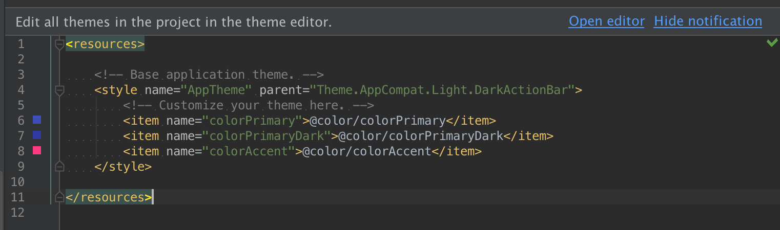
As you can see, our theme has a parent named Theme.AppCompat.Light.DarkActionBar (feel free to modify this using code autocompletion to see what other themes are available) and defines three custom colors: colorPrimary, colorPrimaryDark, and colorAccent. This is a convention introduced by using Material Design and AppCompat, that allows us to quickly change the color scheme of the entire application. This AppCompat Theme is a back-port of Material theme (available only on Android 5.0+) to use on older platforms, which is the preferred way to go for the sake of backward compatibility.
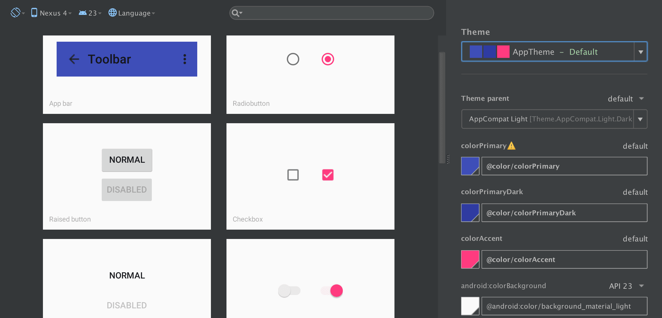
Notice the prompt Edit all themes in the project in the theme editor. -- click on Open editor, it will display the visual editor which helps to find the right color scheme by displaying previews of visual components. This is a very helpful tool.
To customise a color scheme manually, you can always go to /res/values/colors.xml and modify the values, or add new ones with the corresponding theme properties in styles.xml.
Toolbar
The Toolbar is essentially a concrete implementation of App Bar, which has been previously known as the Action Bar. Although visually very similar, the Toolbar brings improvements over the well-known actionbar pattern — being a ViewGroup, it can contain arbitrary widgets within itself and can be placed anywhere in your application layout. It is not part of a window decoration (as a theme attribute) anymore.
Include the Toolbar
Our currently applied theme Theme.AppCompat.Light.DarkActionBar does just that — provides the ActionBar. Let us change that to Theme.AppCompat.Light.NoActionBar in styles.xml. Now there is no default ActionBar added to our Activity layouts, so we need to add it as another widget in the View hierarchy.
<?xml version="1.0" encoding="utf-8"?>
<RelativeLayout xmlns:android="http://schemas.android.com/apk/res/android" xmlns:tools="http://schemas.android.com/tools" android:layout_width="match_parent" android:layout_height="match_parent" tools:context="io.github.adamjodlowski.playground.MainActivity">

    <android.support.v7.widget.Toolbar android:id="@+id/toolbar" android:layout_width="match_parent" android:layout_height="?attr/actionBarSize" android:background="?attr/colorPrimary" android:elevation="4dp"/>

    <TextView android:layout_width="wrap_content" android:layout_height="wrap_content" android:text="@string/header" android:id="@+id/textView" android:layout_below="@id/toolbar"/>

    <Button android:layout_width="wrap_content" android:layout_height="wrap_content" android:text="New Button" android:id="@+id/button" android:layout_below="@+id/textView" android:layout_alignParentLeft="true" android:layout_alignParentStart="true"/>

</RelativeLayout>
We have added the Toolbar and moved the TextView relatively below it by adding the android:layout_below="@id/toolbar property. As you can see, so far it is empty.
The Toolbar can be set up as the ActionBar for the Activity, but that needs to be done in code. Modify the MainActivity.java. Notice the support package containing the Toolbar:
package io.github.adamjodlowski.playground;

import android.os.Bundle;
import android.support.v7.app.AppCompatActivity;
import android.support.v7.widget.Toolbar;

public class MainActivity extends AppCompatActivity {

    @Override
    protected void onCreate(Bundle savedInstanceState) {
        super.onCreate(savedInstanceState);
        setContentView(R.layout.activity_main);

        Toolbar toolbar = (Toolbar) findViewById(R.id.toolbar);
        setSupportActionBar(toolbar);
    }

}
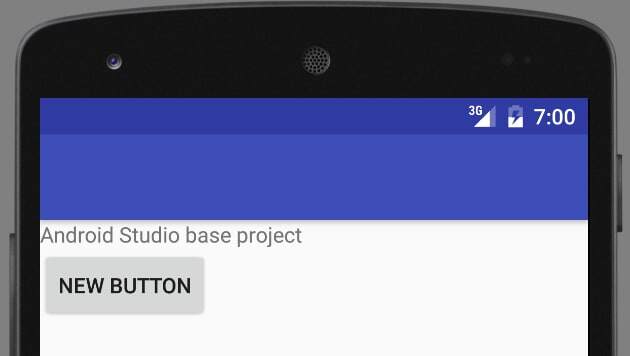
Now, run the app. It displays the Playground title in the Toolbar, but it is black on dark blue background — remedy this by setting additional properties on it:
android:theme="@style/ThemeOverlay.AppCompat.Dark.ActionBar"
app:popupTheme="@style/ThemeOverlay.AppCompat.Light"
The popupTheme will come in handy in the next section.
Setup the action menu
In order to provide custom actions in the Toolbar, we need to perform the same steps that the ActionBar would require:
- define menu XML
- implement callback methods in the Activity
Create a new resource file /res/menu/main.xml:
<menu xmlns:android="http://schemas.android.com/apk/res/android" xmlns:app="http://schemas.android.com/apk/res-auto">

    <item android:id="@+id/action1" android:title="Action 1" app:showAsAction="ifRoom"/>

    <item android:id="@+id/action2" android:title="Action 2" app:showAsAction="never"/>

</menu>
Add two methods to the MainActivity.java:
    @Override
    public boolean onCreateOptionsMenu(Menu menu) {
        MenuInflater inflater = getMenuInflater();
        inflater.inflate(R.menu.main, menu);
        return true;
    }

    @Override
    public boolean onOptionsItemSelected(MenuItem item) {
        switch (item.getItemId()) {
            case R.id.action1:
                Log.d("PLAYGROUND", "Action 1 selected");
                return true;
            case R.id.action2:
                Log.d("PLAYGROUND", "Action 2 selected");
                return true;
            default:
                return super.onOptionsItemSelected(item);
        }
    }
You should see action items in the Toolbar now.
Customise Toolbar
Because it is an ordinary ViewGroup component, we can place arbitrary View hierarchies inside it. Modify the Toolbar node in activity_main.xml:
<android.support.v7.widget.Toolbar android:id="@+id/toolbar" android:layout_width="match_parent" android:layout_height="?attr/actionBarSize" android:background="?attr/colorPrimary" android:elevation="4dp" android:theme="@style/ThemeOverlay.AppCompat.Dark.ActionBar" app:popupTheme="@style/ThemeOverlay.AppCompat.Light">
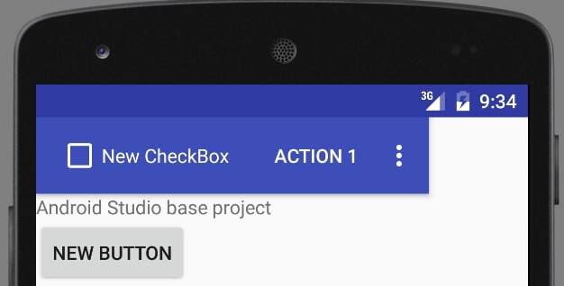
<CheckBox android:layout_width="wrap_content" android:layout_height="wrap_content" android:text="New CheckBox" android:id="@+id/checkBox"/>
</android.support.v7.widget.Toolbar>
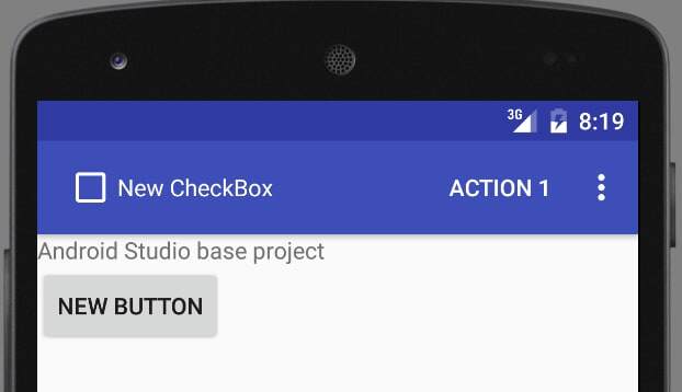
In MainActivity.java, get a reference to ActionBar in the onCreate() method and hide its title:
getSupportActionBar().setDisplayShowTitleEnabled(false);
Please notice that we are using SupportActionBar. It gives us a reference to the activity's ActionBar, in this particular case — it is a Toolbar instance, fully compatible with the ActionBar's API. The final effect should look like this:
TextInputLayout
This handy layout wraps around the TextView and provides a few useful functions that most Android programmers have had to code manually at some point. Add this XML to the activity layout:
    <android.support.design.widget.TextInputLayout android:id="@+id/input_email" android:layout_width="match_parent" android:layout_height="wrap_content" android:layout_below="@+id/button">

        <EditText android:id="@+id/email" android:inputType="textEmailAddress" android:layout_width="match_parent" android:layout_height="wrap_content" android:hint="Provide email address"/>

    </android.support.design.widget.TextInputLayout>
And this code at the end of the onCreate() method:
TextInputLayout emailInput = (TextInputLayout) findViewById(R.id.input_email);
emailInput.setCounterMaxLength(20);
emailInput.setCounterEnabled(true);
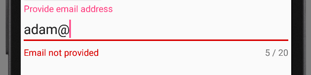
emailInput.setError("Email not provided");
This code:
- adds a counter to the TextView, sets its max number of characters and enables it
- adds an error message that normally should be done dynamically in response to some kind of validation method
The final effect looks like this:
Floating Action Button
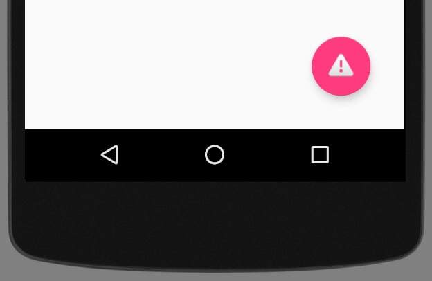
FAB is a new concept of a single, clearly visible ImageButton that invites the user to take a significant, contextual action specific to the screen he is on. This may be composing a new email, taking a photo, or editing the currently viewed calendar event. It is also a showcase of shiny new Material properties, which are elevation (casting a shadow on elements underneath) and the ripple click effect.
Add the FAB at the end of the layout file:
<android.support.design.widget.FloatingActionButton android:id="@+id/fab" android:layout_width="wrap_content" android:layout_height="wrap_content" android:src="@android:drawable/ic_dialog_alert" android:layout_alignParentBottom="true" android:layout_alignParentRight="true" android:layout_alignParentEnd="true" android:layout_margin="32dp" app:fabSize="normal"/>
Let's add OnClickListener in MainActivity's onCreate() method:
final FloatingActionButton fab = (FloatingActionButton) findViewById(R.id.fab);
fab.setOnClickListener(new View.OnClickListener() {
    @Override
    public void onClick(View v) {
        fab.hide();
    }
});
As you can see, the FAB has the additional functionality of animating its view when hiding or showing.
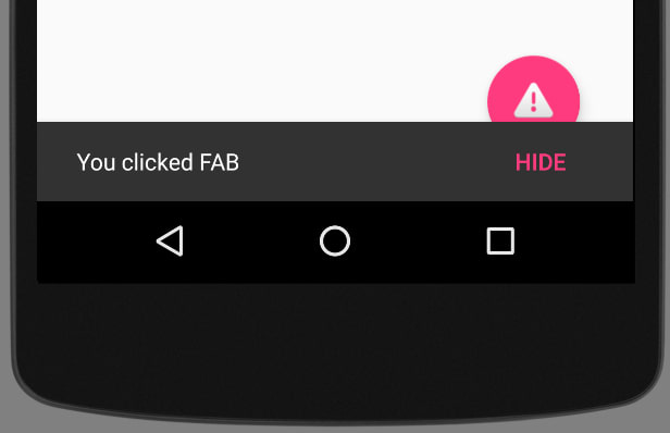
Snackbar
The Snackbar is a next-level Toast. It can briefly appear on the screen and can have one optional action that happens on click. It is usually used to confirm actions, such as archiving an email or sending a message and additionally provides a contextual undo action for what we have just done. It is straightforward to use because the API is similar to its predecessor. Modify the part of the code responsible for the FAB from the previous section:
    final FloatingActionButton fab = (FloatingActionButton) findViewById(R.id.fab);
    fab.setOnClickListener(new View.OnClickListener() {
        @Override
        public void onClick(View v) {

            Snackbar
                .make(v, "You clicked FAB", Snackbar.LENGTH_INDEFINITE)
                .setAction("Hide", new View.OnClickListener() {
                    @Override
                    public void onClick(View v) {
                        fab.hide();
                    }
                })
                .show();

        }
    });
Play with the Snackbar.LENGTH parameters, different text colors and custom duration you can set via helper setters. As you can see:
- instead of
Context, we provide aViewfor Snackbar construction (see the next section) - the action text has been capitalized
- the Snackbar appeared on the bottom of the screen, without any changes to the XML layout
- by default, it covers everything underneath — this is not good when we use FAB, but we will fix it in the next section
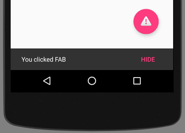
CoordinatorLayout
What we were missing in the previous section is the CoordinatorLayout — an intelligent FrameLayout that is aware of the interactions between views — scrolling, moving views around, etc. By implementing Behaviors, child views can define their interactions and layout modifications they would like to perform in reaction to others. Support Library components provide default behaviors, and we are going to make use of those now.
Modify the activity_main.xml to accommodate CoordinatorLayout and extract the FAB from the RelativeLayout containing other components:
<?xml version="1.0" encoding="utf-8"?>
<android.support.design.widget.CoordinatorLayout xmlns:android="http://schemas.android.com/apk/res/android" xmlns:app="http://schemas.android.com/apk/res-auto" xmlns:tools="http://schemas.android.com/tools" android:id="@+id/coordinatorLayout" android:layout_width="match_parent" android:layout_height="match_parent" tools:context=".MainActivity">

    <RelativeLayout android:layout_width="match_parent" android:layout_height="match_parent" tools:context=".MainActivity">

        <!-- declarations of other components -->

    </RelativeLayout>

    <android.support.design.widget.FloatingActionButton android:id="@+id/fab" android:layout_width="wrap_content" android:layout_height="wrap_content" android:src="@android:drawable/ic_dialog_alert" android:layout_margin="32dp" android:layout_gravity="end|bottom" app:fabSize="normal"/>

</android.support.design.widget.CoordinatorLayout>
We have wrapped the FAB into a CoordinatorLayout in XML, now we need to set it as Snackbar's anchor view in onCreate():
final CoordinatorLayout coordinatorLayout = (CoordinatorLayout) findViewById(R.id.coordinatorLayout);

final FloatingActionButton fab = (FloatingActionButton) findViewById(R.id.fab);
fab.setOnClickListener(new View.OnClickListener() {
    @Override
    public void onClick(View v) {

        Snackbar
            .make(coordinatorLayout, "You clicked FAB", Snackbar.LENGTH_INDEFINITE)
            .setAction("Hide", new View.OnClickListener() {
                @Override
                public void onClick(View v) {
                    fab.hide();
                }
            })
            .show();

    }
});
Thanks to the default Behaviors and CoordinatorLayout, Snackbar pushes up the FAB when it appears on screen.
PercentRelativeLayout
One neat addition to the SupportLibrary is PercentRelativeLayout that (finally) allows us to define relative dimensions as a percentage of available space.
Add the dependency in the build.gradle file:
compile "com.android.support:percent:23.2.1"
Change the RelativeLayout to PercentRelativeLayout and alter the width of Toolbar (just for fun) replacing android:layout_width="wrap_content" attribute with app:layout_widthPercent="80%":
<?xml version="1.0" encoding="utf-8"?>
<android.support.design.widget.CoordinatorLayout xmlns:android="http://schemas.android.com/apk/res/android" xmlns:app="http://schemas.android.com/apk/res-auto" xmlns:tools="http://schemas.android.com/tools" android:id="@+id/coordinatorLayout" android:layout_width="match_parent" android:layout_height="match_parent" tools:context=".MainActivity">

    <android.support.percent.PercentRelativeLayout android:layout_width="match_parent" android:layout_height="match_parent">

        <android.support.v7.widget.Toolbar android:id="@+id/toolbar" app:layout_widthPercent="80%" android:layout_height="?attr/actionBarSize" android:background="?attr/colorPrimary" android:elevation="4dp" android:theme="@style/ThemeOverlay.AppCompat.Dark.ActionBar" app:popupTheme="@style/ThemeOverlay.AppCompat.Light">

        </android.support.v7.widget.Toolbar>

        <!-- declarations of other components -->

    </android.support.percent.PercentRelativeLayout>

    <!-- declarations of other components -->

</android.support.design.widget.CoordinatorLayout>
Feel free to rotate the screen to see if the width is still relative to the overall width. The final effect should look like this (it also proves that the Toolbar is just another View):
You can encounter errors using those percentage attributes:
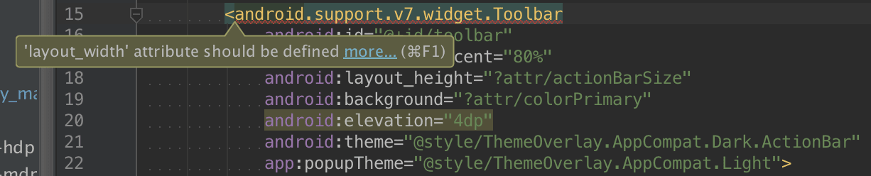
This will go away once the tools get updated to recognize the Percentage Library, but the actual compilation should go just fine.
Summary
In this tutorial, you have learned the basics of Material Design, which dramatically changed how modern Android apps look like, as well as interact with the users. You are now able to take advantage of the most popular building blocks provided by Android and to use the Design Support Library on newest and older Android devices.
The source code for this tutorial can be found on GitHub.


