With 2019 behind us, I thought it would be a fun idea to list out all my favorite features that came to the web in 2019. We saw a lot of great functionality come to fruition, both from the developer's perspective and the user's perspective. This article serves in part to bring more attention to features that I believe are worth a look.
These are my personal picks, starting from least favorite to most favorite. This is not a list of all web features introduced in 2019, just the ones that stood out to me.
I won't be going into too much detail of what the individual features do or how they work, as that has already been thoroughly explained in their official release channels or in other documentation. Click on the links provided at the start of each item for that. My focus will be on why I picked them and what impact I think they'll have on myself and the web.
I'm going to follow up with a post about my favorite DevTool features of 2019 in a few days, so stay tuned for more if that sounds interesting to you.
Honorable Mentions
KV Storage
A proposal for an async key/value storage API for the web.
– http://wicg.github.io/kv-storage
This might've slipped under your radar. An async alternative to localStorage has been under discussion for quite some time. The main idea is to improve the terrible performance and degraded user experience that comes with the synchronous nature of localStorage, because it blocks the main thread.
If you were unaware of this (let's face it, not all localStorage usages are intensive enough to cause noticeable performance differences for everyone), check out Chris Heilmann's old, but still relevant article: There is no simple solution for local storage.
The proposed alternative to the above-mentioned problem is "KV Storage". A working version finally landed in Chrome 74. Read about it in the links provided above. I'm really looking forward to this API reaching stability and being implemented everywhere. It should bring significant improvements to our web apps!
CSS Properties and Values API
- https://developer.mozilla.org/en-US/docs/Web/API/CSS_Properties_and_Values_API
- https://drafts.css-houdini.org/css-properties-values-api/
- https://developers.google.com/web/updates/2019/10/nic78#css-prop-val
- https://web.dev/css-props-and-vals/
The CSS Properties and Values API — part of the CSS Houdini umbrella of APIs — allows developers to explicitly define their CSS custom properties, allowing for property type checking, default values, and properties that do or do not inherit their value.
– MDN
This is a feature that looked pretty exciting to me, until I actually tried it. Misusing a CSS variable just results in its value being ignored. It doesn't result in any runtime errors or warnings. Even if you use this API and register the property, you still don't get any error or warnings, even though the default value kicks in.
This is fundamentally different from how we usually experience default values in other ecosystems. If you were to pass the wrong value type to a property with a default value in a statically or dynamically typed language, you would get a type error at compile time or runtime, instead of getting the default value applied there and the execution continuing.
For those reasons, I think the term "type checking" doesn't protect you against much. It's a little bit misleading in this context too, and I probably would've suggested different terminology if I were part of the team that wrote the spec.
Also, registering the property with JS after your CSS has loaded will override whatever value you defined for it in :root or html. The CSS way of doing it with the @property syntax isn't implemented yet, so you would need to refactor some of your existing code for it to play well with this functionality. You need to extra careful to get this right.
I also don't feel that the "default values" feature is that useful either, as I don't see it being such a problem in an organized codebase. Even if the codebase wasn't organized, this is the kind of thing you would immediately catch when testing your changes in the browser.
To me, the most practical application of this addition right now is transitions. Without this API, if you tried to use an animation that relies on a custom CSS property, it just wouldn't work. The browser wouldn't know how to interpret those values in that context. By registering the property with this API, it provides the browser with the necessary information to interpolate correctly.
As of right now, I can't think of many instances where this would improve my developer experience or the code quality of my stylesheets and design systems. On another note, this was only added to a very recent version of Chrome and nowhere else yet, so it doesn't seem very reasonable to introduce this in your workflow yet.
Still, it is very exciting to finally see more of Houdini being implemented in some browsers. I can't wait to see the rest of the APIs land!
The rendersubtree attribute
- https://github.com/WICG/display-locking/blob/master/README.md
- https://github.com/whatwg/html/issues/4861
- https://developers.google.com/web/updates/2019/12/nic79#rendersubtree
- https://www.chromestatus.com/feature/4613920211861504
Adds the rendersubtree attribute to all HTML elements, which locks a DOM element for display. When rendersubtree is set to "invisible", the element's content is not drawn or hit-tested, allowing for rendering optimizations. The rendersubtree "activatable" token allows the browser to remove the invisible attribute, rendering the content, and making it visible.
– Chrome Platform Status
I am immediately drawn to any feature that improves the performance of my apps. When I saw the addition of the rendersubtree HTML attribute, I was intrigued. Because this is extremely recent, I haven't used it yet, but I'm looking forward to using it in production. I'll definitely do some benchmarking when I do.
I don't expect the differences to be that significant for small to medium trees, and huge trees are not very common in the apps I've been working with recently. So it'll be a while until I can directly benefit from this. Still, it's nice to know it exists and that I can reach for it if necessary.
Largest Contentful Paint (LCP)
Largest Contentful Paint (LCP) is an important, user-centric metric for measuring perceived load speed because it marks the point in the page load timeline when the page's main content has likely loaded—a fast LCP helps reassure the user that the page is useful.
– Philip Walton
A new API that allows us developers to better measure the performance of our sites. This bridges a gap in performance measurement that other existing APIs like load, DOMContentLoaded, First Paint, First Contentful Paint (FCP), and others didn't cover.
Sometimes it is very difficult to justify efforts for optimizing our code and our app's performance. Tools like this allow us to easily lay out objective measurements that can make this investment decision much easier not just for us, but also for our business and product management teams.
It is much easier to get budget for performance improvements and technical debt when you have numbers to back it all up, and that's why I'm happy this exists.
Several utility functions added to JavaScript
Object.fromEntries. https://v8.dev/blog/v8-release-73#object.fromentries.String.prototype.matchAll(). https://v8.dev/blog/v8-release-73#string.prototype.matchall.Promise.allSettled. https://v8.dev/features/promise-combinators#promise.allsettled.
I'm grouping all these under one section because there's not much to say about them other than what has already being said in the links above and all around the web.
They're all great to have official native support for, but they're not higher on my list of favorites because we've been able to use some of them for a while already, thanks to compilers like Babel and TypeScript.
There have been okay workarounds for some of these with plain JS as well. For instance, Object.fromEntries can be polyfilled with a one-liner using Array.prototype.reduce, and Promise.allSettled's behavior can be simulated with some clever promise wrapping.
In other words, their entry into the language won't make such a meaningful impact on a developer's life or the web. Nonetheless, they're nice to have.
Public & private class fields in JavaScript
We've been writing class fields in JavaScript for many years now, thanks to tools like Babel and TypeScript, so some people may be surprised to know that, until very recently, all that was non-standard JavaScript. The proposal hadn't yet formally reached Stage 3 of the TC39 process, which is why there hadn't been many official implementations.
But that changed in 2019, when we saw it implemented natively, with no compilation necessary in Node 12 and Chrome 72 & 74!
This didn't make it to my list of absolute favorites, because we've had tools that allowed us to use this syntax for a long time now. Even though this is already implemented in several platforms, Babel's plugin currently still tries to compile the private fields even when using loose mode. It offers no configuration options to skip it.
The TS implementation (which hasn't landed in any version yet; it was merged literally about 2 weeks ago) will do the same, so you won't be able to benefit from the engine's native implementation of the private variant if you use any of these tools (at least for now). This means that there will be no significant improvements to bundle size and no significant improvements to performance.
Really Happy About
backdrop-filter CSS property
- https://developer.mozilla.org/en-US/docs/Web/CSS/backdrop-filter
- https://www.chromestatus.com/feature/5679432723333120
- https://web.dev/backdrop-filter/
The backdrop-filter CSS property lets you apply graphical effects such as blurring or color shifting to the area behind an element. Because it applies to everything behind the element, to see the effect you must make the element or its background at least partially transparent.
– MDN
A new CSS property that allows us to be more creative with our designs and UIs! Check out this CodePen by Robin Rendle to see a demo of what it is about.
Here's a more common use case of what this property now lets us implement natively in the browser, without ugly hacks:

To be perfectly fair, this was already implemented in Safari and Edge years ago, but 2019 saw it land on Chrome 76. Only Firefox is missing!
Compute img/video aspect ratio from width and height HTML attributes
- https://github.com/WICG/intrinsicsize-attribute/issues/16
- https://www.chromestatus.com/feature/5695266130755584
This was an extremely easy one to miss, as it wasn't promoted much at all through the usual release channels. However, if you do a lot of front-end work, this will make you very happy! In my opinion, this should've been made more public, as I think it's a great feature (or fix, depending on how you look at it). Since there isn't much documentation about it out there, I'll go into a little bit more detail about this particular item.
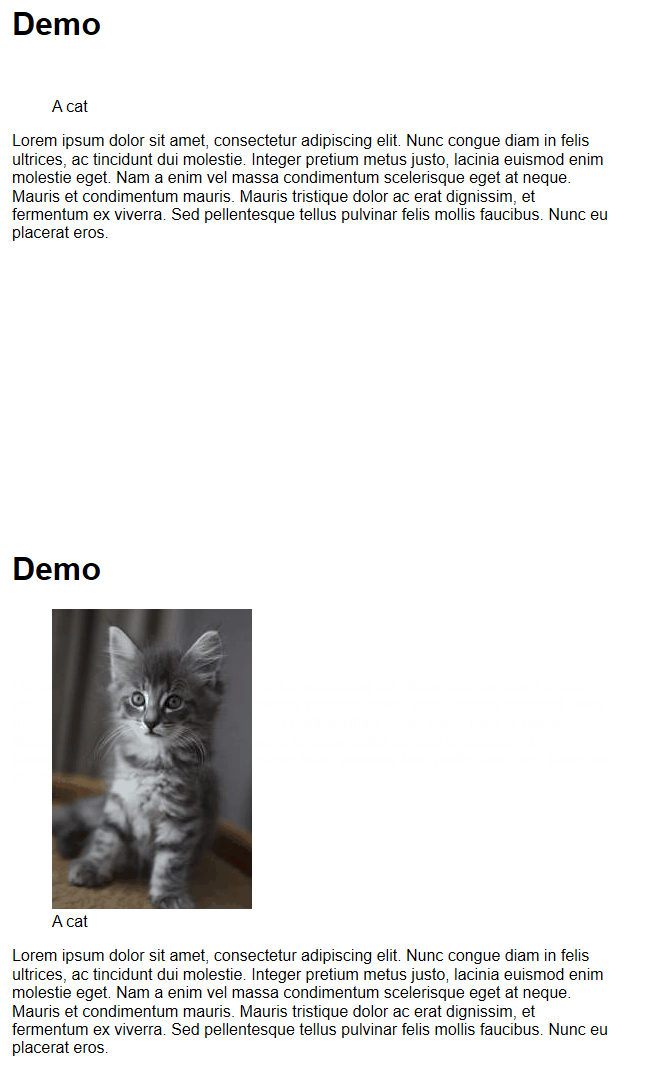
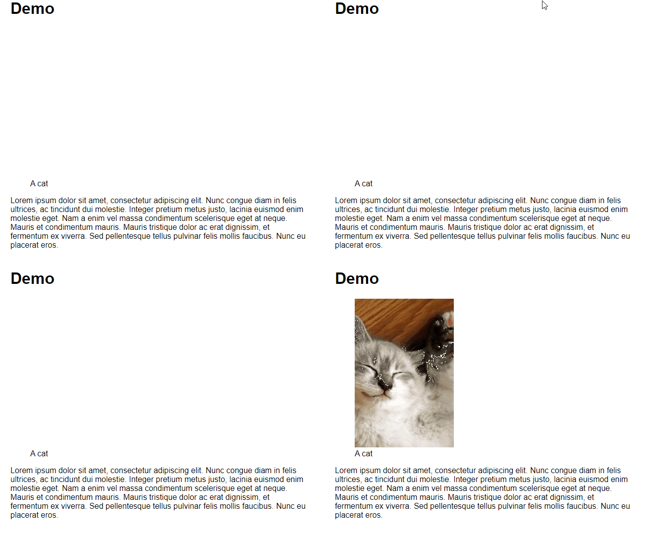
Previously, if you had an image tag with explicitly defined width and height HTML attributes, and you wanted this image to be as wide as the parent's element, you would naturally use CSS width: 100%. The problem was that the browser wasn't able to correctly compute the aspect ratio before the image loaded. So you'd end up with the page content/layout jumping around and being repositioned after the image had loaded. This problem is called layout shifting.
Before:

After:
Now, as long as the image has height: auto, the content won't jump around anymore:

Here's an online demo.
This feature/fix only landed in Firefox and Chrome as of this writing, so you might still see the old behavior in other browsers. Kudos to the Firefox team for leading this effort!
However, it's worth mentioning that this won't work on iframes (which I don't think will affect many people).
Here's a video by Jen Simmons from Mozilla where she demonstrates the issue and the fix herself in more detail:
Desktop PWAs
I don't develop or work with Progressive Web Applications (PWAs), so any PWA-related feature is irrelevant to my day-to-day work at the moment. But I still recognize their value and always stand in admiration whenever I see some new advancements made on that front.
When I originally came across PWAs, I perceived them as a mobile-only feature. It never occurred to me that we could benefit from them in the desktop world, but here we are! I highly recommend that you install the PWAs of the websites you frequently use, as the user experience is much snappier than through the browser.
I use them myself and can happily recommend them to anyone. It also makes me believe that desktop PWAs could even replace some simple (and maybe even not so simple) Electron apps. This would further decrease the barrier of entry to native development.
PWAs in general are very exciting. If you haven't had the chance to research and experiment with them yet, give them a shot. The coolest thing about PWAs is that it requires little effort to turn your existing web app into a PWA. All you need is a manifest.json file, a minimal service worker, and you're good to go!
My Absolute Favorites
prefers-color-scheme media query
- https://developer.mozilla.org/en-US/docs/Web/CSS/@media/prefers-color-scheme
- https://web.dev/prefers-color-scheme/
"Theprefers-color-schemeCSS media feature is used to detect if the user has requested the system use a light or dark color theme."
– MDN
Example:
@media (prefers-color-scheme: dark) {
  body { background: black; color: #ddd; }
}

@media (prefers-color-scheme: light) {
  body { background: #eee; color: black; }
}
As a developer, I haven't had the opportunity to leverage this feature yet. But I have built theme-able sites, and you might end up including styles for themes in your bundle that are never actually used if you're not careful. So if your themes are exclusively dark/light (which I assume is the majority of use cases), having this feature available as a media query allows you to more easily optimize. Just write something like:
<link href="/light.css" rel="stylesheet" media="(prefers-color-scheme: light)">
<link href="/dark.css" rel="stylesheet" media="(prefers-color-scheme: dark)">
Note that you might be able to get away with just one stylesheet for both themes if you rely on custom CSS properties. It'll just be a little bit more challenging and might require some more clever architecting.
This feature gets extra points in my book because I benefit from it a lot as a user, because my preferred color scheme is dark. I'll benefit even more as websites adopt this new media query in the future. Having the web adapt to that automatically as I browse will improve my user experience and quality of life.
Hardware Media Keys support
Desktop Chrome users can now use the media keys on their keyboards and headsets, like play/pause, previous and next track to control the audio, and video playback in the browser.
This is a very niche feature that will only have an impact in a very small subset of developers, since not all of us work with media-related apps. Regardless, it's a very welcomed feature from the user's perspective that will further improve our experience on the web!
I personally love this one, as I consume a lot of media on the web and have a headset with very accessible and easy-to-use media keys. I bet that developers working on these kinds of apps are very happy to see this become reality as well.
Additions and improvements to the Intl API
There have been several additions to the internationalization API in late 2018 and 2019:
Intl.RelativeTimeFormat. https://v8.dev/features/intl-relativetimeformatIntl.DateTimeFormatimprovements. https://v8.dev/blog/v8-release-76#intl-datetimeformatIntl.ListFormat. https://v8.dev/features/intl-listformatIntl.Locale. https://v8.dev/blog/v8-release-74#intl.localeIntl.NumberFormatadded capabilities. https://v8.dev/features/intl-numberformat
Any improvement or addition on Intl is an enormous win for the web, because it allows us developers to rely on the platform for anything related to internalization, instead of having to pull in third-party libraries, bloat the size of our bundles, and increase the surface area of bugs and complexity in our codebase.
I'm particularly excited about the date- and time-related ones. Currently, a very popular library for that is moment, which is a surprising 231.7
kB minified and 65.9 kB minified + gzipped. You can write entire apps smaller than 65 kBs!
Although the improvements on the Intl API are not a replacement for everything that moment can do, I have worked with websites where all of moment's usages could be replaced with Intl.RelativeTimeFormat and Intl.DateTimeFormat. I'm fairly certain that such a scenario is not a rare occurrence.
Not all apps require internationalization though, so this is not something that absolutely everyone can benefit from. Unlike my next pick.
Native Lazy Loading
- https://addyosmani.com/blog/lazy-loading/
- https://web.dev/native-lazy-loading/
- https://github.com/scott-little/lazyload/
- https://github.com/whatwg/html/pull/3752
Lazy loading is a strategy that delays the loading of some assets until they are needed by the user based on the user's activity or navigation pattern. If correctly implemented, this delay in asset loading is seamless to the user experience and might help improve initial load performance, including time to interactive, as fewer assets are required for the page to start working.
– MDN
Lazy loading can greatly improve the user experience of any app in all situations, and the benefits are significantly greater for users with low-end devices and poor network conditions.
So the fact that lazy loading images and iframes are now natively supported in Chrome is huge news! Specifically because of how easy and plug-and-play the whole functionality is. Just add the loading HTML attribute:
<img src="..." alt="" loading="lazy" />
Although it is not yet supported across all major browsers and MDN still considers this an "experimental" feature, it is perfectly safe to use, as other platforms will simply ignore it and default to their existing behavior anyway.
It is also very easy to polyfill. Check some of the links above for a super simple polyfill implementation or check out this link for a more robust one.
I already went ahead and added loading="lazy" in all my image tags for some of my projects, and I've seen improved performance. It's probably the feature with the highest benefit to cost ratio that I can think of in recent memory.
Conclusion
So that's it. It was difficult to rank them and you can come up with arguments that will rank any of these higher than other ones, but don't get too lost on that.
What about you? Do you have any particular favorite picks? Did I miss anything relevant? Would you like to elaborate on the importance or lack of importance of any particular pick? Let me know in the comments below.
Like I said in the beginning, I'm going to follow up with a post about my favorite 2019 DevTools features in a few days, so stay tuned for that!
TABLE OF CONTENTS


