
52.2% of all website traffic worldwide was generated through mobile phones in 2018. Given the variety of screen sizes of smartphones, this has made responsive web design more important than ever before. Web pages have to render well regardless of the medium you use.
However, creating complicated multi-column layouts consistently across different devices (and browsers) is not a simple task. A few years ago, web designers were confined to using tables, floats, positioning, and in-line blocks that were missing lots of functionality. It was a frustrating experience.

This lack of functionality drove the development of proper responsive layout models that made it easier to create, understand, and maintain web layouts. CSS Grid and Flexbox are two of the most popular layout models.
But how do you know which one to use? How do both models differ between themselves? That's what we'll answer in this article.
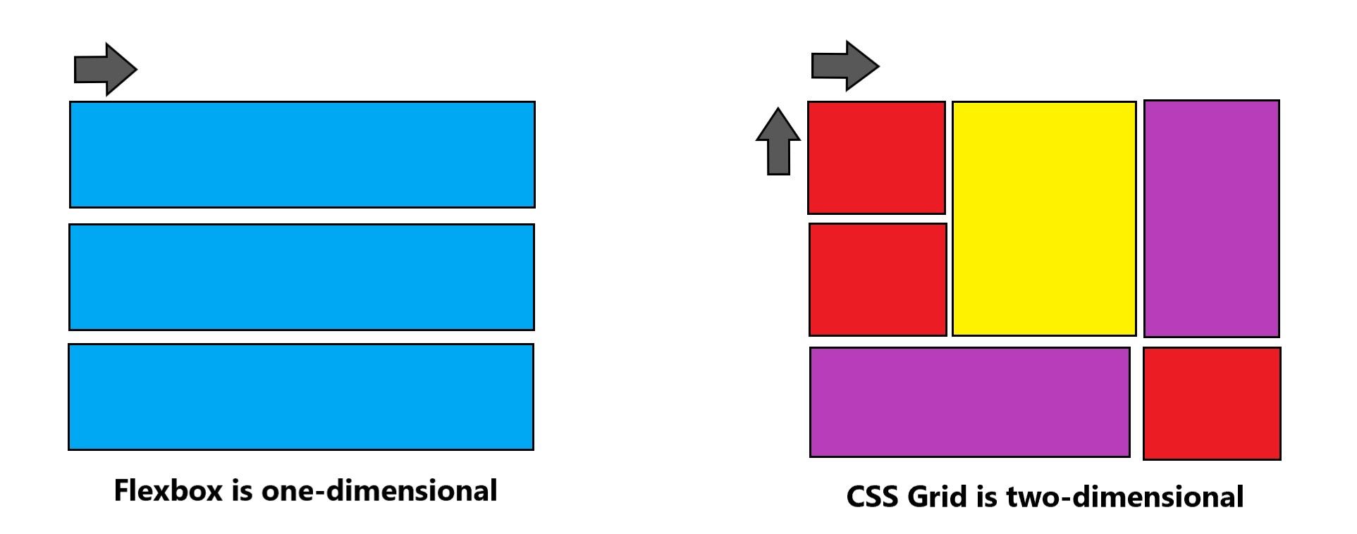
1D vs 2D
The most fundamental difference between Grid and Flexbox is how they handle positioning. Grid is perfect for the two-dimensional layout of items on a web page or app, as it can manage both columns and rows at the same time. This is useful, for example, when you're designing a web page where you want a sidebar next to a few rows of content.
Flexbox, however, is one-dimensional. It handles either a column or a row. A flexbox container expands its items to fill the available free space or it shrinks to prevent overflow.
Content-Based vs Container-Based
A Flexbox layout is calculated after its content is loaded. It's content-based. The size of a cell (a flex-item) is defined inside the flex-item itself. Here's an example to explain what that means. This is a row of elements styled with Flexbox:
The parent div is the flex-container, but we don't set the size of the items there. That's done in the flex-items, where it's been defined by setting flex: 1 1 auto. The flex property is shorthand for flex-grow, flex-shrink, and flex-basis.
CSS Grid, however, requires you to define your layout first. It's container-based. The layout is calculated regardless of the content you put inside the containers. Let's look at our example again, except that we'll now style it with Grid.
As you can see, the output is exactly the same as in the Flexbox example (apart from the color). Here, however, the size of the items is not defined inside the grid-items, but in the grid-container, parent div, through grid-template-columns.
Because of this, CSS Grid is better to make whole page layouts and Flexbox is better when you're aware of the content you'll use.
A Different Way of Wrapping Items
Although both models have ways to wrap items that are greater than the width of the container, each model handles wrapping very differently.
The most important thing to remember is that items in Flexbox lose the context of the previous row or column when they're pushed into a new row or column. That's because Flexbox is one-dimensional.
In CSS Grid, however, items don't lose their context when they're pushed down, because they're still part of the grid you've defined before. Items will fall along the grid lines.
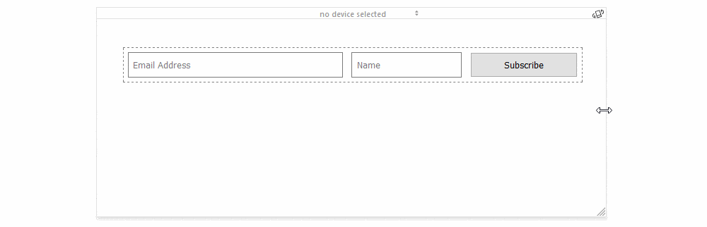
Either ways of wrapping can be useful. Flexbox usually works better with forms, for example, like a subscribe form with three buttons (email, name, send), because you want each button to take up as much space as possible as the screen shrinks or expands.
CSS Grid is better when you want your pushed items to maintain the same width, as you might want to when creating an image gallery, for example.
Which One to Choose?
If you need a web layout that only consists of rows or columns, then Flexbox is the best model to use. However, if you have a complex, multi-row and multi-column layout, then you'll want to use CSS Grid.
Additionally, don't think you have to choose either CSS Grid or Flexbox. You might want to design your overall web layout with CSS Grid, but use Flexbox for certain parts of your website. Both solve layout problems in different ways and there's no reason both models can't work in complementary ways to create the website you want.
SHARE:


