
React is the most commonly used web framework available today. What started as an agnostic UI library developed by Facebook in 2011 and made open-source in 2013 is now widely used to build compelling user interfaces.
React consists of components, small pieces of code that fill a certain part of the UI you’re building. Think of these components as JavaScript functions that have properties and a state as input and give a description of a UI as output.
The React ecosystem has grown incredibly large over the years. It’s now possible to generate a static site using React with Gatsby, create a mobile app with React Native, and even create desktop applications with Electron. There’s a lot to discover, but in this blog post we’ll focus on the most powerful React component libraries in 2022.
Ant Design
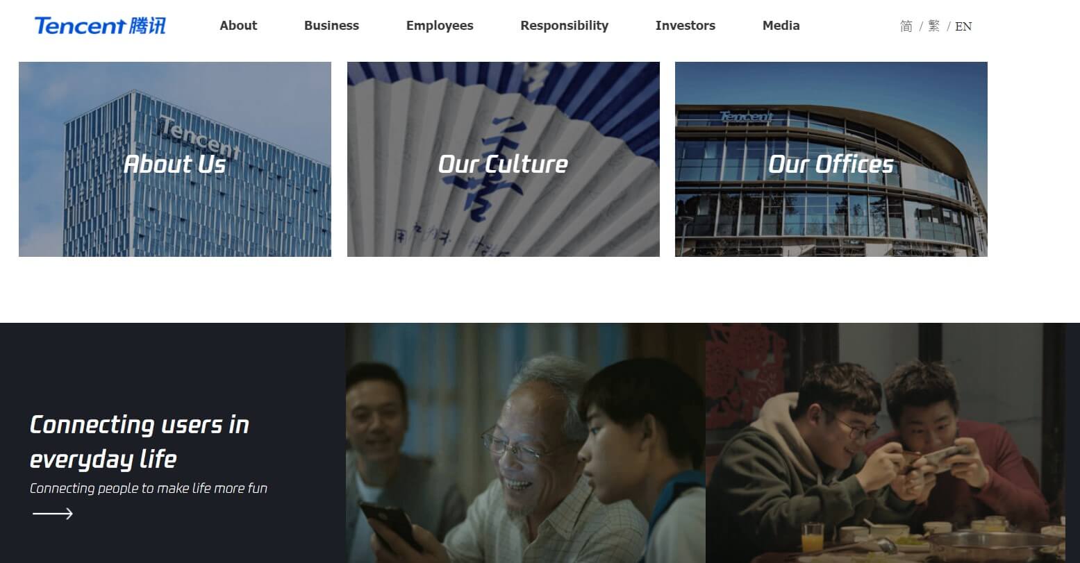
Ant Design is a Chinese company with a React library designed for web apps of large companies. Examples include Tencent, Alibaba, and Baidu. The library has over sixty components and is written in TypeScript with predictable static types. Its English-language docs are clean, well-written, and comprehensive.
But Ant Design is more than just a React UI library. It’s an entire design system built around the values of growth, meaningfulness, certainty, and naturalness. Have a look at their resources for Figma UI kits, landing page templates, a Sketch plugin, and more.
MUI Core
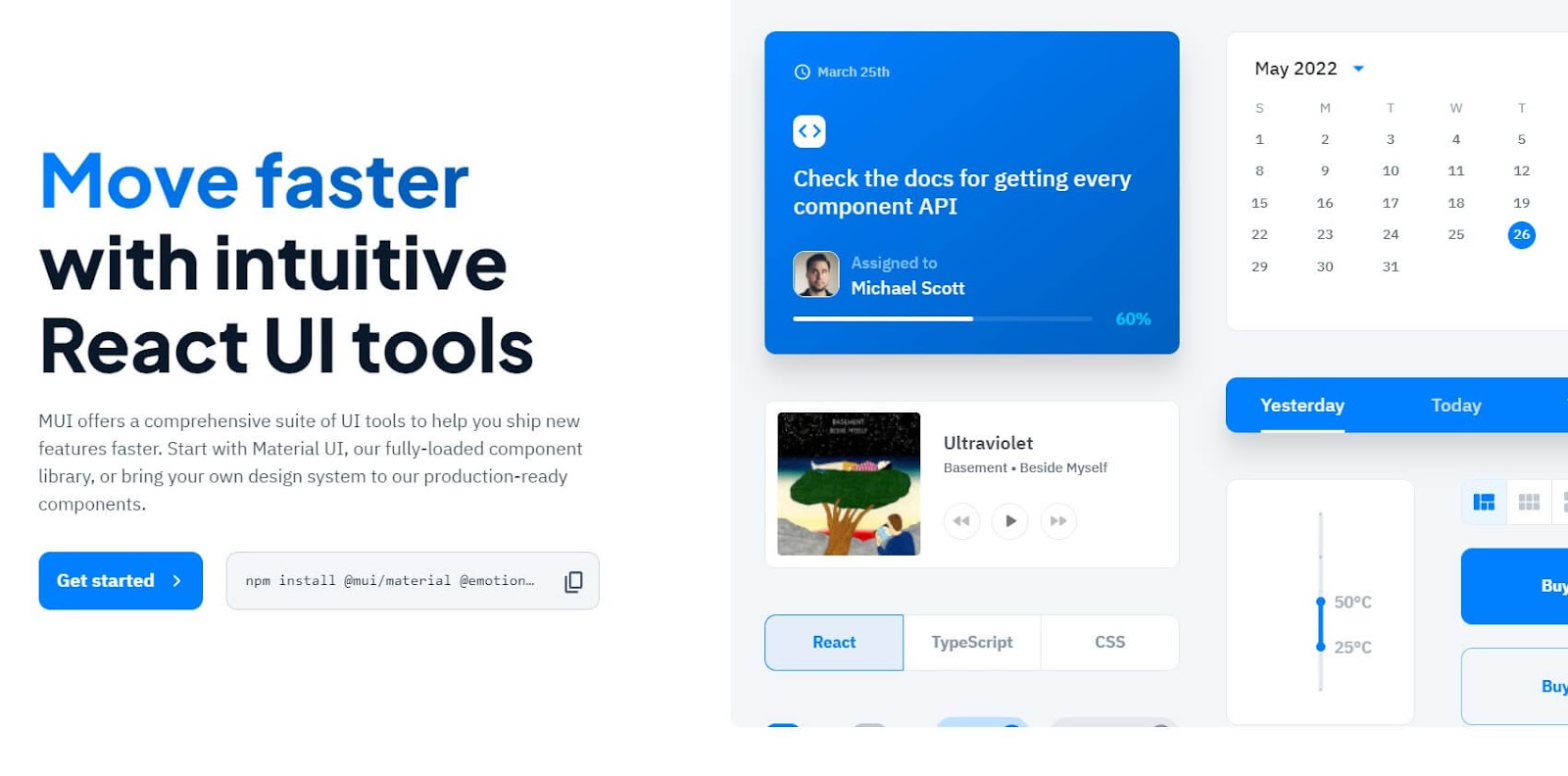
MUI Core, formerly known as Material-UI, is the most popular React component library on GitHub after Ant Design. The React library is simple, lightweight, and built according to Google’s Material Design specs. There are components for layouts, forms, navigation, data display, and many other widgets.
You can style your components with a CSS-in-JS solution that’s fast, extensible, and has the same advantages as styled components. MUI Core is also interoperable with other major styling solutions, so you don’t have to use its own styling.
Storybook
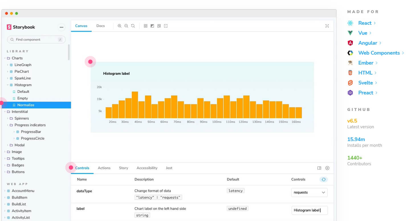
Storybook is a popular open-source UI tool that allows you to build UI components in isolation for React, Angular, Vue, and many other web frameworks and libraries. Because you can build your components in isolation, you don’t need to fuss with data, APIs, or business logic while building.
Storybook makes your UI searchable, generates UI docs automatically, and allows you to reuse components across screens and apps. It is used by companies like AirBnB, GitLab, the British Government, Microsoft, Lyft, and many others.
Blueprint
Blueprint is a React UI library built by Palantir, a US tech company that specializes in big data analytics. Their React library has over forty components optimized in particular for complex data-dense interfaces for desktop applications.
Blueprint is written in TypeScript and so are all the code samples in their docs. The library supports Chrome, Firefox, Safari, IE 11, and Microsoft Edge. Anything IE10 and below is unsupported due to their lack of support for CSS Flexbox Layout.
React Bootstrap
React Bootstrap acts as a replacement for Bootstrap JavaScript. Each component has been built as a true React component, so you don’t need jQuery dependencies. React Bootstrap is one of the oldest React libraries and has grown steadily with React itself.
Bootstrap’s grid system means you’ll have a fully responsive series of containers, rows, and columns for your layout. You can choose between dozens of components, including badges, carousels, toasts, and jumbotrons.
React Admin
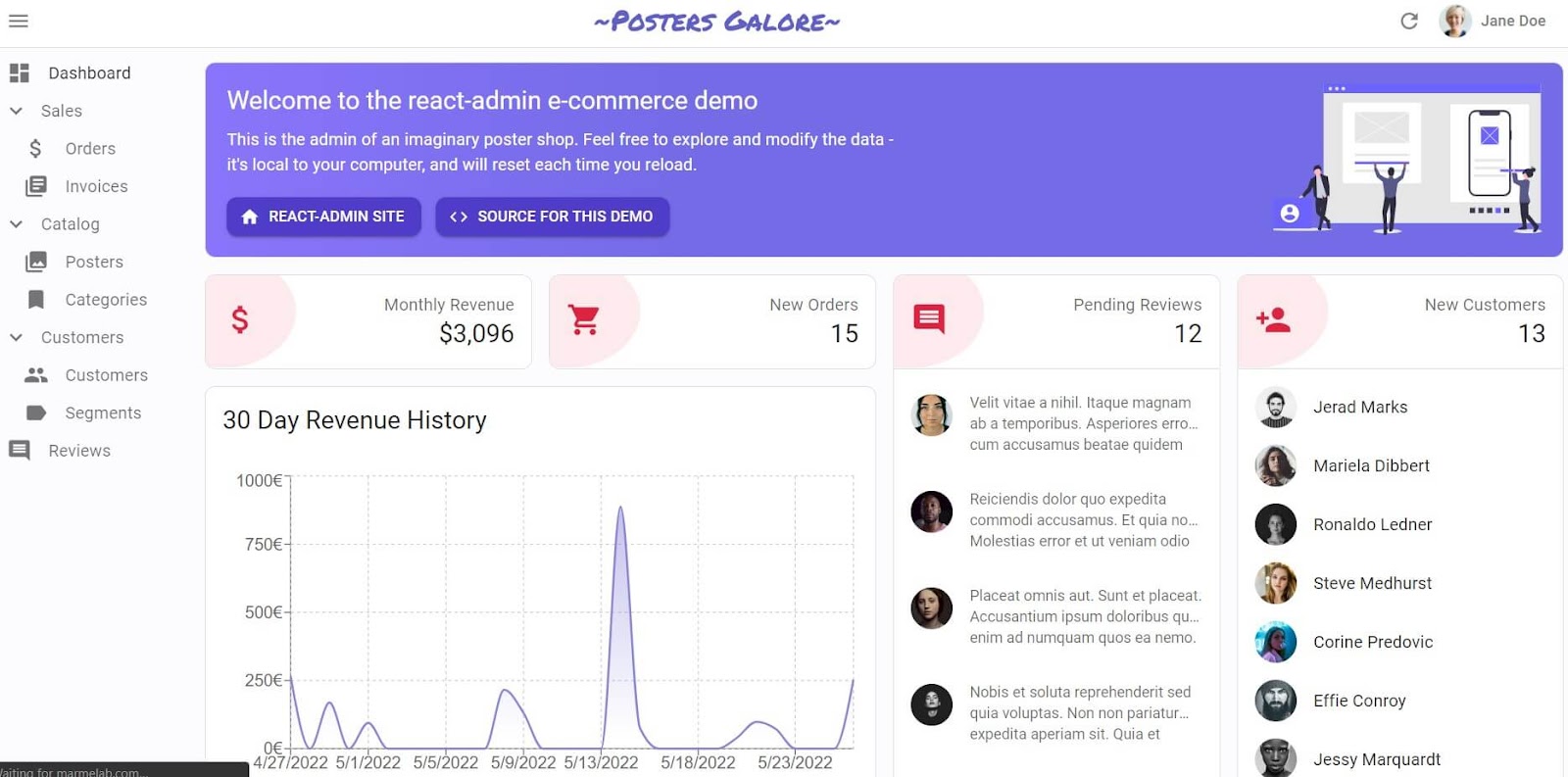
React Admin is a framework for building API-based B2B applications using modern React and Material Design. It focuses on productivity and maintainability so you can build your internal tools or ERPs or B2B apps fast.
React Admin has adapters for most REST and GraphQL dialects, from Django to Prisma to Firebase. Alternatively, you can write your own adapter in minutes. Essentially, React Admin is backend-agnostic. That’s why it’s used by over ten thousand companies, from Nvidia to Intel to Puma.
Evergreen
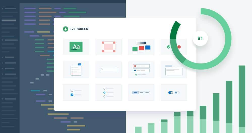
Evergreen is a React library developed by data platform company Segment. Evergreen believes that while you can’t ever predict future requirements, you can prepare for them. It’s a library created for building a system that anticipates new and changing design requirements.
Evergreen's components include buttons, filepickers, select menus, spinners, side sheets, tables, and more. Evergreen v5 only supports theming partially, but the developers will release a new theming API in Evergreen v6 that should make theming more powerful and accessible.
Chakra UI
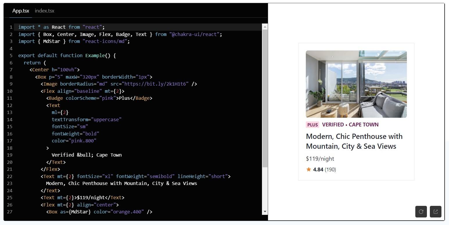
Chakra UI was built in 2019 with simplicity, modularity, and accessibility in mind. It is opinionated, has a fairly intuitive prop-based model of styling components, and comes with dark mode compatibility.
Chakra UI gives developers the freedom to manipulate CSS classes of exported components and layouts with little code. It has built-in support for responsive styling, which makes custom styling much easier.
Gestalt
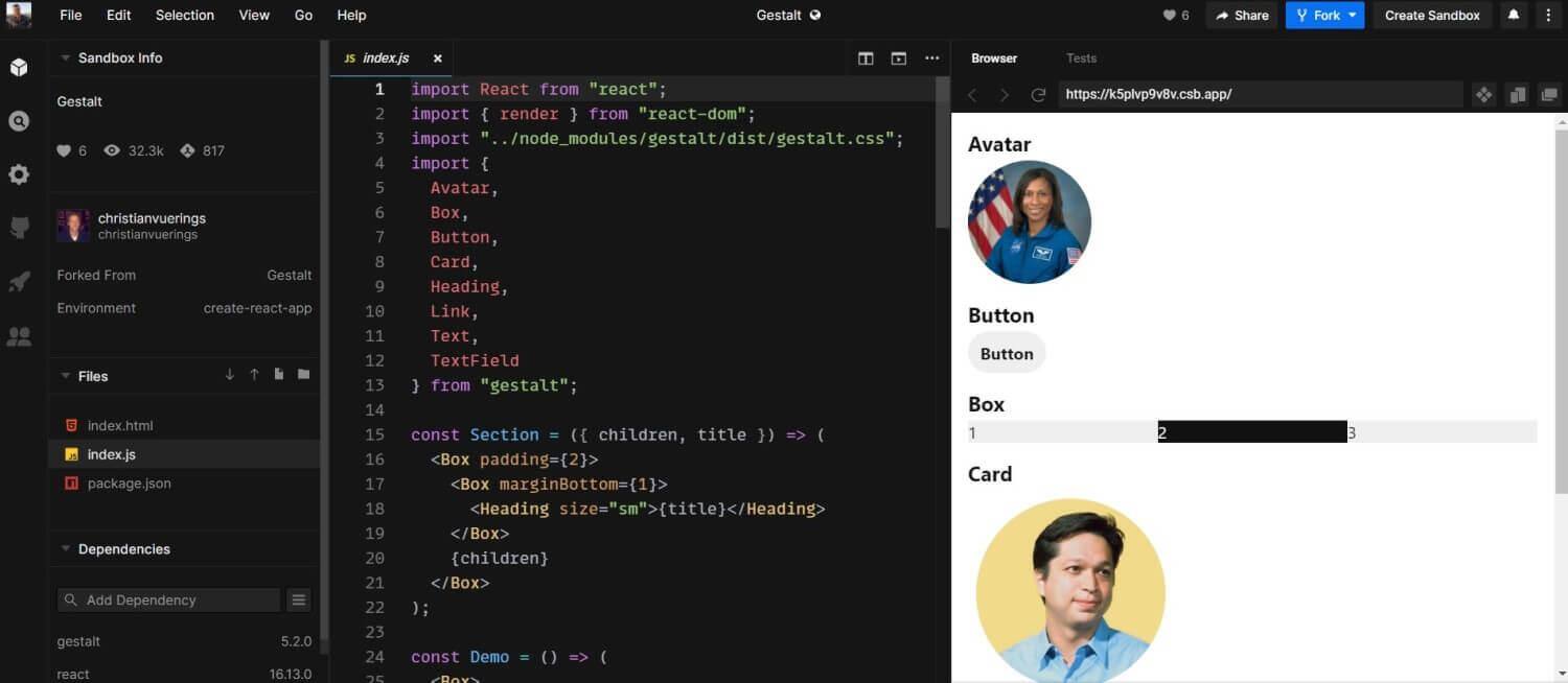
Gestalt is a set of React UI components that enforce Pinterest’s design language. Its intent is to create a shared library of design best practices. The library supports right-to-left, internationalization, and dark mode.
Because of its automatic design and code updates that run cross-platform, Gestalt is relatively low maintenance. When a release will cause breaking changes — in usage or in typing — it provides a codemod to ease the upgrade process.
React Virtualized
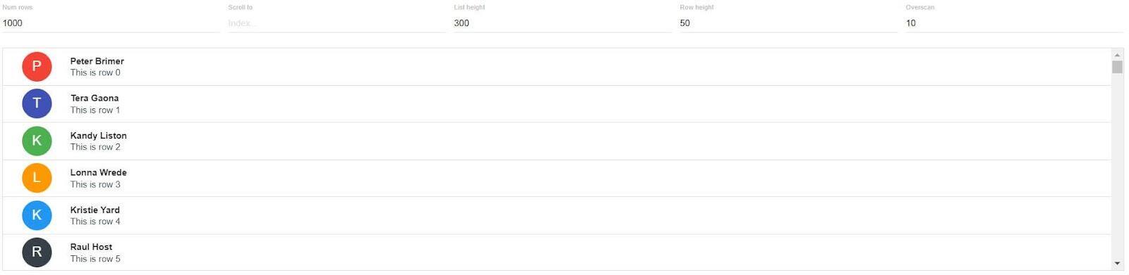
React Virtualized is unique on this list in that it serves a narrow, specific purpose: efficiently rendering large lists and tabular data. This is a helpful library if you have a list with thousands of elements or when you’re trying to render many columns in a single table.
React Virtualized’s components include an arrowkeystepper, an autosizer, a cellmeasurer, a columnsizer, a multigrid, and more. It’s a versatile library that is programmed to satisfy your tabular requirements.
visx
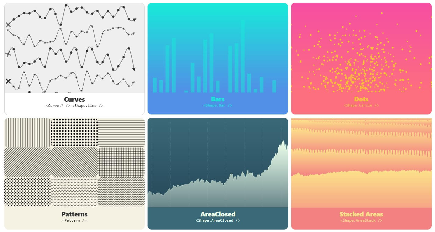
Created by AirBnB, visx is an unopinionated, beautiful collection of expressive, low-level visualization primitives for React. Because it’s a collection of packages, you can use whatever package you need and keep bundle sizes small.
Layouts include networks, heatmaps, geographic projections, stats, wordclouds, and more. All these visualizations use D3 for its calculations. If you like performant, customizable charts, this is the library for you.
Semantic UI React
Semantic UI React is the official plugin for Semantic UI. It’s jQuery-free and has a declarative API, shorthand props, sub-components, augmentation, auto-controlled state, and more. The library boasts a collection of over fifty components, including segments, progress bars, transitions, pagination, and more.
Semantic UI React provides the components while Semantic UI provides the themes as CSS stylesheets. You can also use custom icons by using <Icon className='my-icon'/> instead of <Icon name='my-icon' />.
Rebass
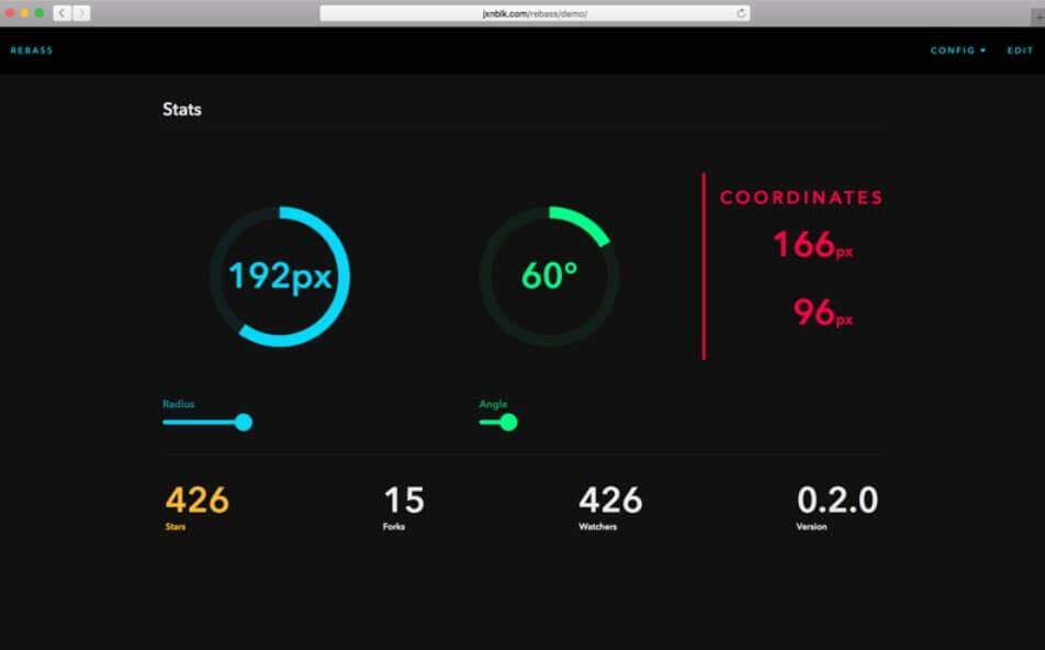
Rebass is a primitive components library built with Styled System by Brent Jackson. It’s built to create a consistent UI with design constraints and user-defined scales. With a footprint of only 4KB, Rebass means fast design and development.
Rebass intends to be minimal, useful, unopinionated, extensible, and themeable through its refirst-class support for theming and its compatibility with Theme UI. The docs include a list of guides on a variety of topics. Read this blog post to learn more about the philosophy behind Rebass.
Headless UI
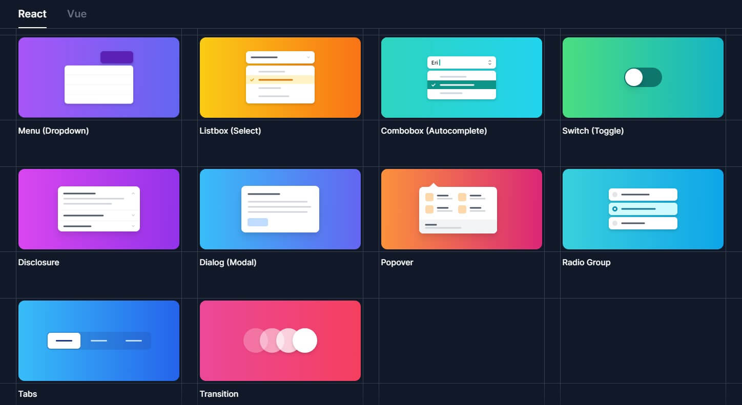
Headless UI is a collection of completely unstyled, fully accessible UI components. Because it separates the logic from its visual components, Headless UI is a great choice if you want to create the design yourself (or have been given a particular design). You can deploy your custom styles to out-of-the-box components with Headless UI.
Headless UI has been designed to integrate with Tailwind CSS. It currently only has a small number of components, but the developers of Tailwind are actively working to expand that number.
SHARE:


